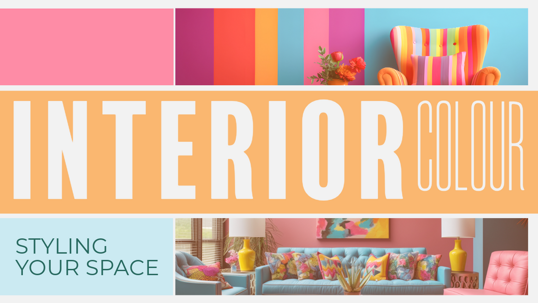
Optimize Your Home's Atmosphere: A Guide to Choosing Colours to Set the Perfect Mood
Unlocking the Power of Colour: How to Harness Emotion in Your Home Design
Colour holds immense power over our emotions, shaping the atmosphere of our surroundings. Countless studies highlight the profound impact of colour on our mood. Picture the tranquillity of stepping into a pristine white room, or the jubilance evoked by vibrant hues. But how can we strategically employ colour to cultivate the desired ambiance in our homes?
Enter colour psychology: a fascinating field that delves into the intricate connections between colour and emotion. In this guide, we'll explore how understanding these links can empower you to curate the perfect mood within your living spaces. Plus, we'll provide expert tips on selecting colours to align with your desired ambiance, ensuring your home reflects the emotional resonance you seek.
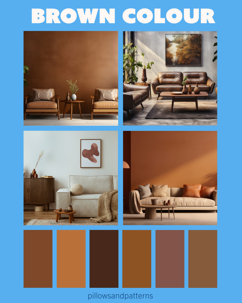
Unlock the Elegance: Harnessing the Sophistication of Black in Your Décor
Black is a commanding colour, exuding sophistication and class that can elevate any space into a style haven. When complemented with other hues, black becomes the epitome of refinement. Incorporate black as an accent to harmonize and anchor your room's aesthetic. Introducing at least one black décor piece not only grounds your colour palette but also adds dimension, enriching the visual appeal of your space.
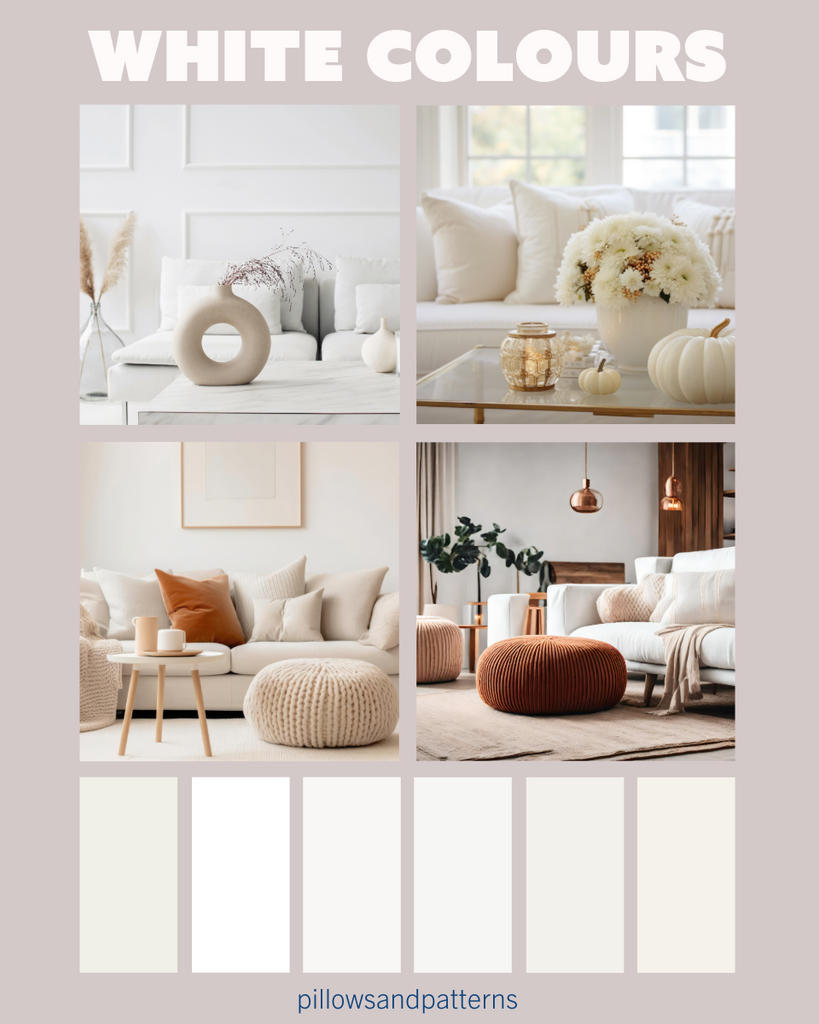
Embracing the Essence of Purity: Understanding the Dynamics of Whites and Neutrals
Whites and neutrals symbolize purity and innocence, offering a versatile canvas for interior design. These hues can evoke warmth or coolness, influenced by their position on the colour wheel. Warm whites and neutrals carry undertones of red, orange, or yellow, infusing spaces with a cosy ambiance. On the other hand, cool whites and neutrals feature undertones of green, blue, or purple, lending a refreshing and serene vibe to any room.
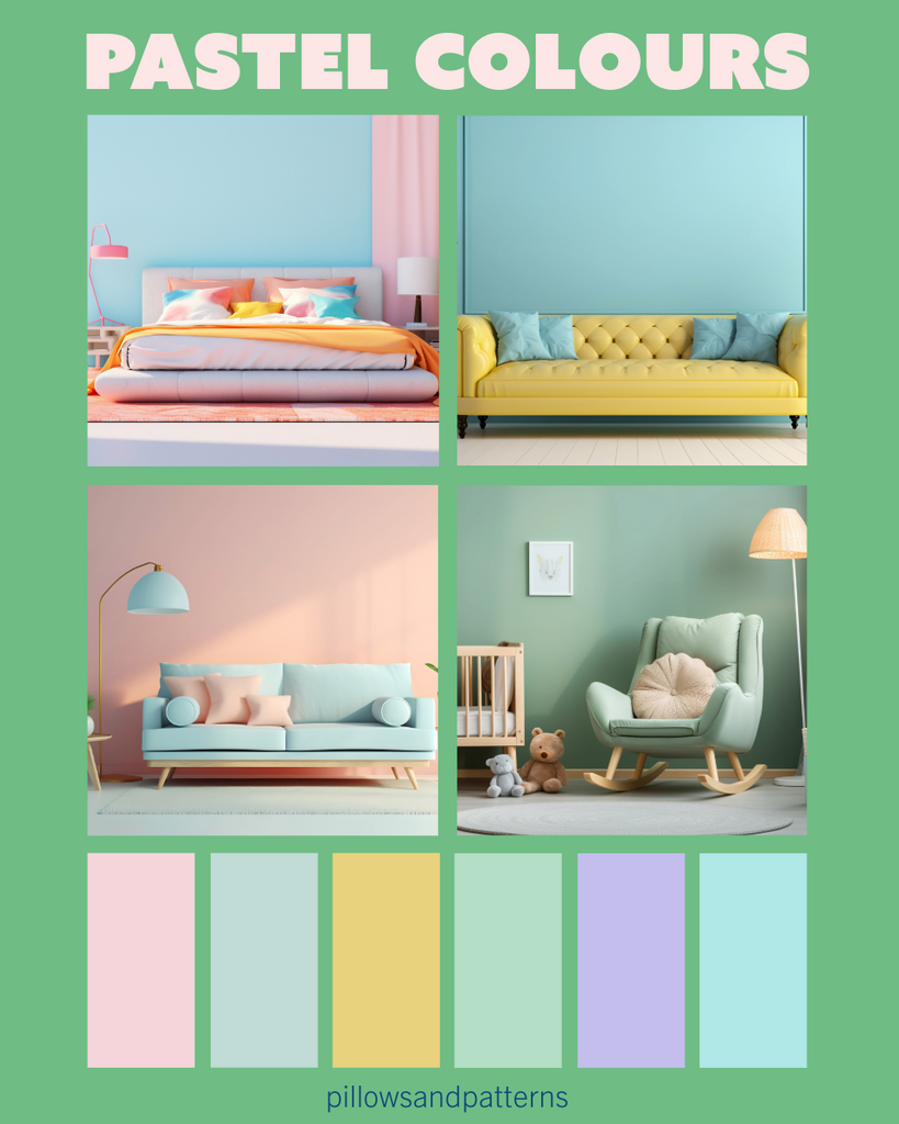
Elevate Your Contemporary Space with Pastels: Adding Character and Charm
Pastel hues inject character and uniqueness into modern interiors, offering a refreshing twist to conventional design. Their gentle, subdued tones bring a sense of beauty and tranquillity to any room, making them particularly well-suited for nurseries, living areas, and bedrooms. Embrace the subtle yet fresh allure of pastels to create spaces that exude both elegance and warmth.
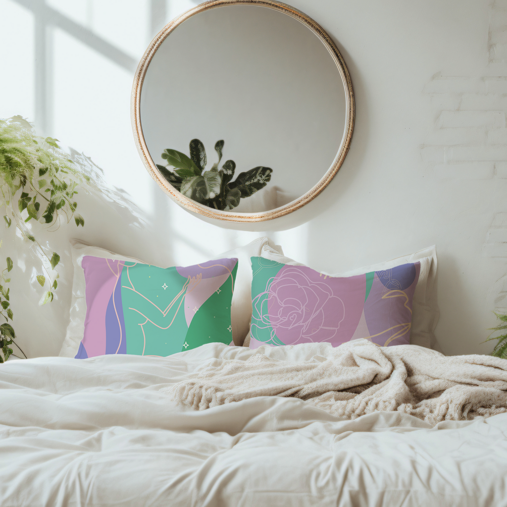
Exploring the Versatility of Pink: Beyond Stereotypes to Sophisticated Elegance
Pink, often hailed as the epitome of femininity, spans a spectrum from delicate blush tones to vibrant fuchsias, evoking sentiments of love and romance. While traditionally linked with nurseries and girls' rooms, modern interpretations offer sophisticated shades that transcend clichés. Dusty, coral, or muted pink hues bring a touch of elegance to any space in your home, striking a balance between sweetness and refined charm.

Elevate Your Interior with Luxurious Purple Tones: Embracing Sophistication and Style
Purple boasts the power to infuse richness and luxury into your home décor. Opt for refined shades such as moody, dark purple-black tones and soft mauve-purple hues to enhance your main living spaces with an air of elegance. In line with current trends, the shade Very Peri stands out as a must-have this year, adding a contemporary twist to your colour palette. Don't miss out on the opportunity to incorporate these sophisticated purple tones for a stylish and on-trend interior aesthetic.
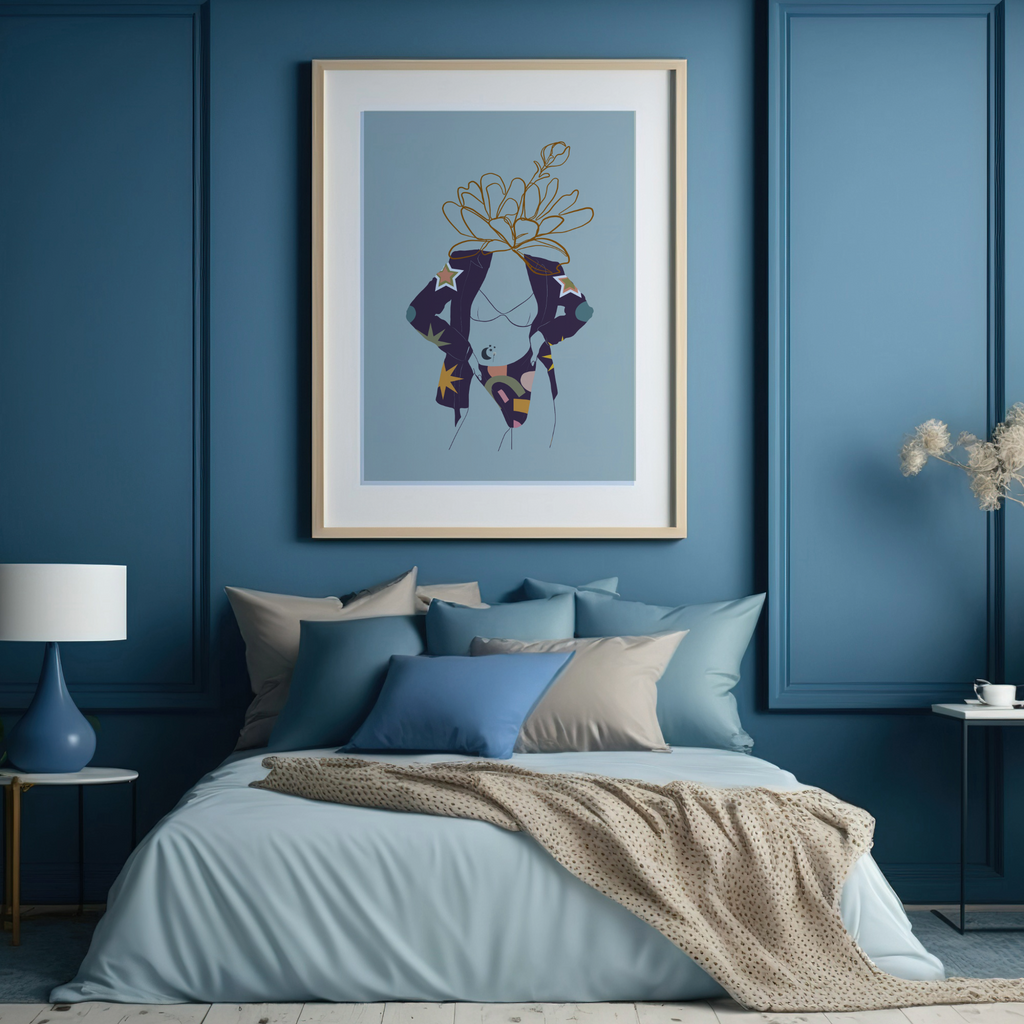
Embrace Tranquillity with Serene Blue: Elevate Your Space with Calm and Balance
Blue, renowned as the most calming colour, embodies feelings of security, order, and tranquillity, making it ideal for spaces like bathrooms where relaxation is paramount. Enhance the calming effect by pairing blue with hints of greens and teals, colours that complement its soothing qualities and amplify the sense of serenity and depth within your environment. Discover how incorporating serene blue tones can elevate your space with a perfect balance of peace and tranquillity.
Unlock the Power of Nature's Hue: Enhancing Balance and Vitality with Green
Green, nature's predominant colour symbolizing harmony and balance, revitalizes spaces with its refreshing aura. Pairing green with complementary hues like calming blue and cheerful yellow intensifies its rejuvenating effects. Versatile and adaptable, green seamlessly fits into every room of the house, promoting relaxation and togetherness in the living room, stress relief in the bedroom—especially when coupled with indoor plants—and a cooling effect in the kitchen. Discover the transformative impact of incorporating green into your home décor to foster balance, vitality, and a deeper connection with nature.
Elevate Your Space with Radiant Yellow: Infuse Warmth and Modernity
Yellow, with its vibrant and cheerful demeanour, is the ideal choice for cultivating a cosy ambiance within your home. Whether used as a bold highlight or in conjunction with black and white for a contemporary touch, yellow brings a burst of sunshine to any space. Opting for muted tones like muddy-yellow allows for subtle yet impactful pops of colour, ensuring a balanced and harmonious aesthetic throughout your home. Explore the transformative potential of incorporating radiant yellow hues to enhance your space with warmth and modern flair.
Elevate Your Space with Passionate Red: Infusing Love, Warmth, and Conversation
Red, a powerful colour synonymous with love, warmth, and passion, adds a dynamic flair to any room. While vibrant, saturated reds may evoke discomfort, opting for more muted shades can create a luxurious and cosy atmosphere. As an energy-boosting hue, red is an excellent choice for stimulating conversation in living or dining areas, enhancing the social atmosphere. Consider incorporating red into your entryway to make a bold and memorable first impression. Explore the transformative potential of passionate red hues to elevate your space with vibrancy and vitality.
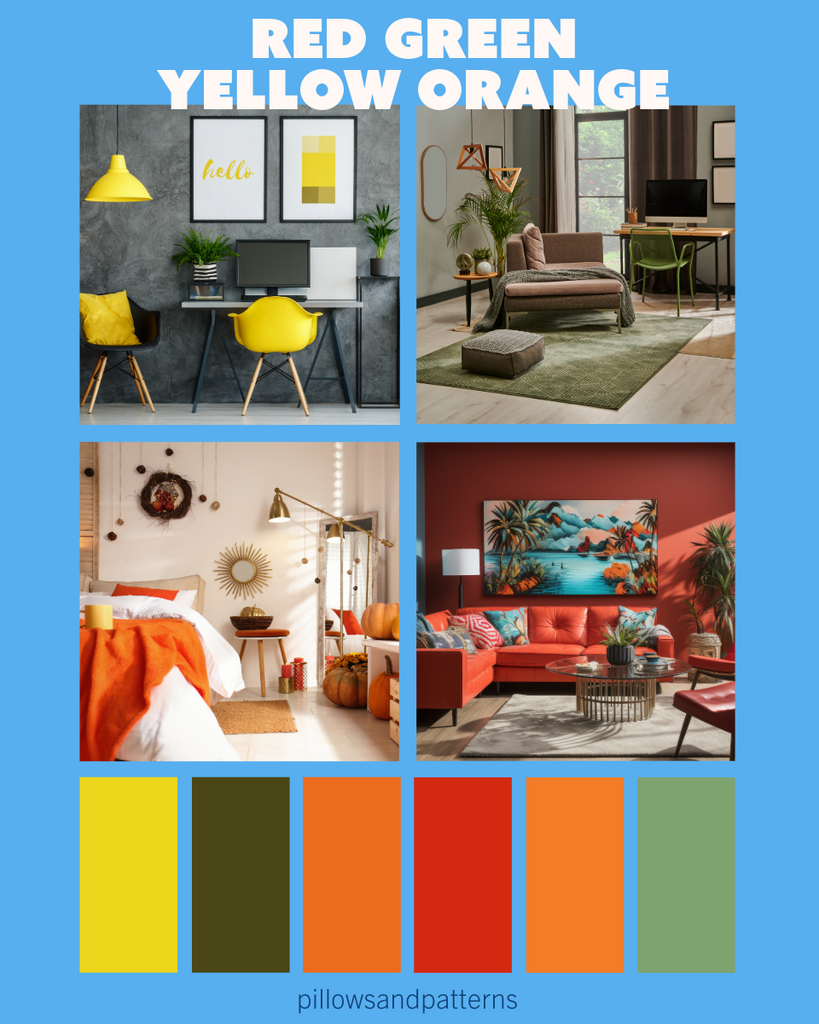
Unleash Energy and Creativity with Vibrant Orange: Exploring the Power of Peach
Orange, known for its bold and energizing qualities, makes a strong statement in any space, evoking feelings of stimulation and vitality. While it may not be ideal for the bedroom where relaxation is key, a softer alternative like peach can introduce a touch of warmth and beauty to the sleeping quarters. For areas where creativity is encouraged or energy is unleashed, opt for more intense shades of orange to promote inspiration and motivation. Discover how incorporating vibrant orange tones, including the subtle allure of peach, can transform your space into a vibrant haven of creativity and vitality.